

Analytics
The per-project dashboard that turns your tickets and history into charts, so you can answer 'are we on track?' at a glance.
Every project has an Analytics page: a dashboard built entirely from tickets you already have - their statuses, dates, estimates, and logged time. You do not configure anything to see the basic charts; money-related figures need a budget and a permission (see below).
Where to find it
Open a project, then click the Analytics icon (a small bar-chart) in the project's header, next to the view switcher.

Who can see it
- The whole page needs the
analytics:viewpermission on the project. If you don't have it, orboto shows "You don't have access to this project's analytics" instead of the page. Ask a project admin to grant it. - Money figures - the Actual cost summary tile, the Budget card, the
Loaded member cost card, and Earned Value's money mode - need the
separate
budget:viewpermission. Without it, those cards simply don't render; everything else on the page still does. - External guest accounts cannot open project analytics at all, regardless of permissions - the aggregates would leak counts from milestones that aren't shared with them.
This page groups the charts by topic across five linked chapters. This page covers the always-visible top of the dashboard; the rest continue below.
Controls that apply across the page

- Date range picker (top right: Last 7/30/90 days, This quarter, Year to date, All time, or a custom From/To pair). It only affects some of the charts - see the table below. Changing it does not reload the whole page; each card that listens to the range re-fetches on its own.
- Milestone selector. A dropdown lives inside the Burndown card, but it is not local to burndown: picking a milestone there also re-scopes the Delivery forecast, Human + agent collaboration, and Earned Value sections further down the page to that milestone. Leaving it on "All milestones" scopes those the same way, to the whole project.
- CSV button on most cards - downloads that card's underlying data as a CSV file, for pasting into a spreadsheet or another tool. Each card exports independently; there is no single "export everything" button.
- Summarize project (top right, sparkle icon) - asks the AI assistant for a one-off written paragraph summarizing the project's current state. Only shown when your workspace has AI configured. See AI assistant.
- The gear icon (top right, only if you can edit the project) jumps straight to the project's settings, where budgets and rates are configured.
Which cards actually listen to the date-range picker:
| Card | Scoped by the range picker? |
|---|---|
| Overview numbers | No - always lifetime totals |
| Burndown | No - scoped only by the milestone selector |
| Velocity | Yes |
| Cycle time | Yes |
| Workload | Yes (falls back to the current week if you leave the picker on its default) |
| Loaded member cost | Yes |
| Human + agent collaboration | Yes, and by the milestone selector |
| Flow & lead time, Delivery forecast, Flow metrics, Bottleneck & predictability, Estimation accuracy | No - each uses its own fixed lookback window, described on the Flow, cycle time and forecasting page |
| Budget, Earned Value | No - both work from the project or milestone's whole life, not a window |
If a number on this page doesn't match a number on another, check this table first - a common misreading is assuming every chart shares one clock.
Overview numbers
Four tiles at the very top of the page:
- Total tickets - every ticket in the project, any status.
- Estimated time - the sum of every ticket's time estimate.
- Logged time - the sum of every time entry ever logged on the project.
- Actual cost (needs
budget:view) - those logged hours priced at each contributor's hourly rate (see Budget and cost tracking for exactly how a rate is resolved).
These are lifetime totals - the date-range picker does not affect them.
Burndown
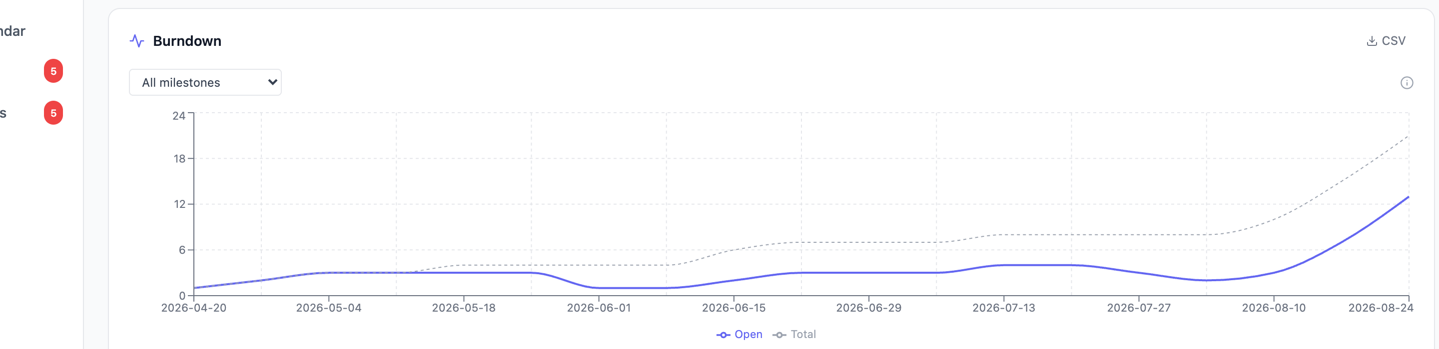
The burndown chart shows, over time, how many tickets are still open (not
WONT_FIX, not done) against an ideal line.
- Open (solid line) - open ticket count on that day.
- Total (dashed grey line) - every ticket that existed by that day (open or closed), so you can see scope grow.
- Ideal (dotted line, only shown when you pick a specific milestone with both a start and an end date) - a straight line from the milestone's peak ticket count at its start down to zero at its end. It is not a prediction; it is the reference line for "if we closed tickets at a perfectly constant rate, this is where we'd be."
How to read it: if the Open line sits above the Ideal line, you're behind that pace; below it, you're ahead. A line that tracks the ideal closely is healthy; a line that flattens out (stops dropping) while Total keeps climbing means new work is arriving faster than it's closing.
Use the dropdown above the chart to scope to one milestone (this also enables the ideal line) or leave it on "All milestones" for the whole project's history, anchored to the earliest ticket's creation date. The X-axis groups by day, week, or month automatically depending on how long the window is (day up to 60 days, week up to a year, month beyond that).
Velocity
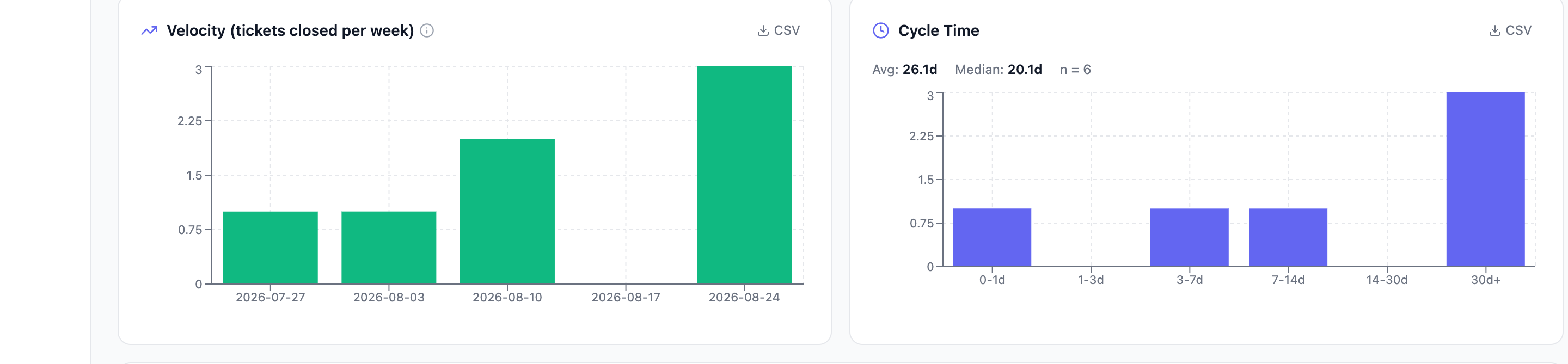
A bar per week showing how many tickets closed that week (again
excluding WONT_FIX - scope that was cut isn't "delivered"). Scoped by the
date-range picker; with no range selected it shows the last 8 weeks.
How to read it: a roughly even bar height week to week means your team's throughput is predictable, which makes "how much can we commit to next sprint" a safer question to answer. A jumpy, spiky pattern (a big bar followed by near-zero) is a signal to look at what caused the spike - a batch of small tickets closed together inflates a single week without reflecting a real capacity change.
Workload
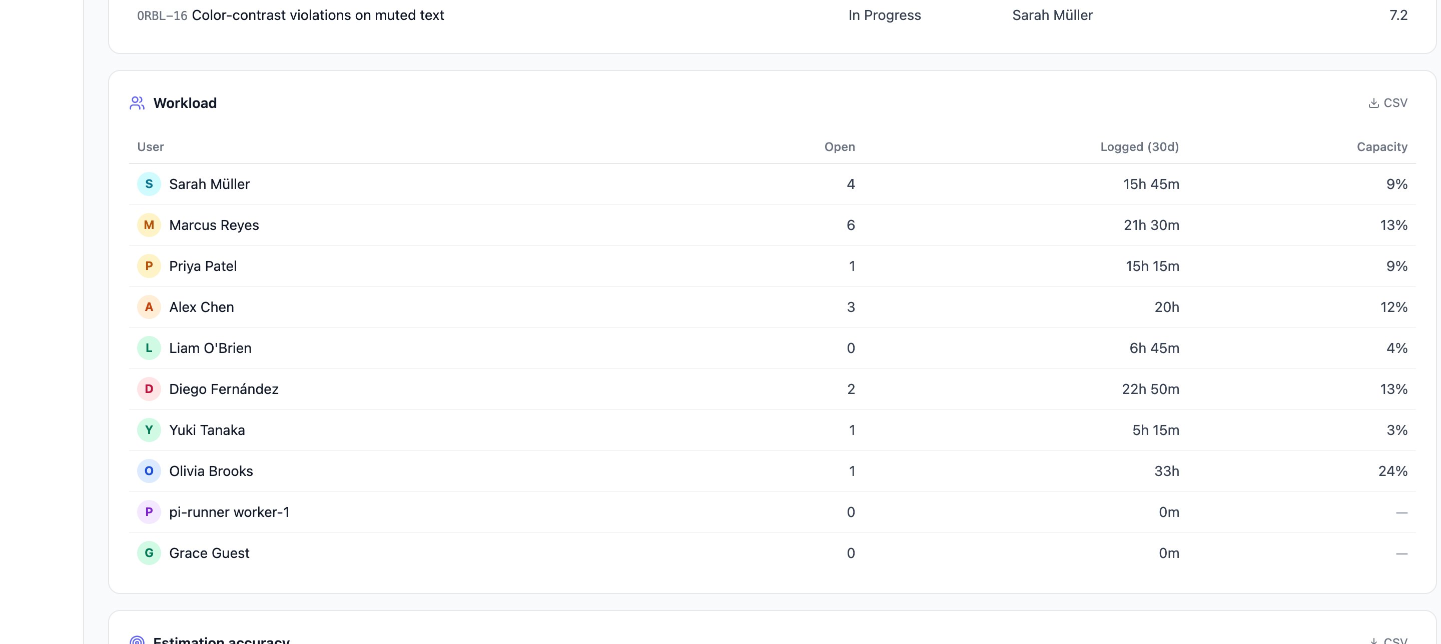
One row per project member:
- Assigned - open (not-done) tickets currently assigned to them in this project. Not scoped by the date-range picker - it's a snapshot of right now, regardless of which range you picked.
- Logged - time they logged in the selected range (or lifetime, if you picked "All time").
- Capacity - logged hours in the range as a percentage of their expected hours for that many days, derived from their weekly capacity (set on their user profile). Shown in red above 100%. A member with no weekly capacity set shows a dash instead of a percentage - there's nothing to compare against.
This table is project-scoped: it only shows time and assignments inside this one project. For a person's workload across every project they're on, use the workspace-wide Capacity page instead - the two intentionally answer different questions.
Troubleshooting
- "You don't have access to this project's analytics." You're missing
analytics:viewon this project. Ask a project admin to grant it - this is not something you can self-serve. - The Actual cost tile, Budget card, or Loaded member cost card are just
missing (not empty - absent). You have
analytics:viewbut notbudget:view. Ask a project admin for the additional permission if you need to see money figures. - Burndown is empty / has no ideal line. An empty chart means the
project (or the selected milestone) has no tickets yet. A missing ideal
line means the selected milestone has no start date, no end date, or both
- set them in the milestone's details.
- A number changed after I picked a different date range, but another number on the same page didn't. Expected - see the scoping table above. Not every card listens to the range picker.
- Guest / external account gets a 403 opening this page. By design - external guests cannot see project analytics at all, even with permission, because the aggregates would leak private-milestone counts they shouldn't see.
Where to go next
Flow, cycle time and forecasting
Cycle time, lead time, delivery forecasting, WIP and bottlenecks.
Estimation, collaboration and activity
How accurate estimates are, how humans and agents split the work, and git activity.
Budget and cost tracking
Configured budgets, per-person cost, and loaded cost including AI usage.
Earned Value Management
Whether your spend and schedule bought the progress they should have.
Capacity planning
Workload across every project a person is on, not just this one.
Requirements documents
Turn this project's data into a customer report or a requirements specification.